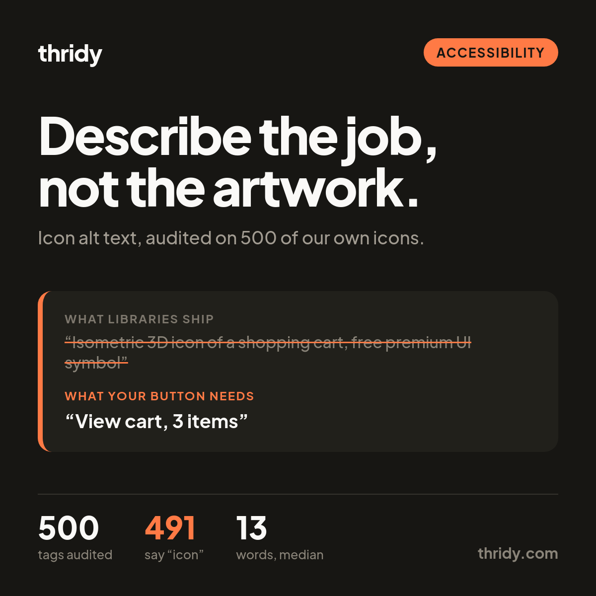
Every icon we publish ships with an alt tag. We wrote it, it sits in the API next to the file, and you can paste it into an <img> and move on with your day. That is the problem. The alt text an icon library ships is written to describe an icon in a catalog. The alt text your product needs describes what that icon does inside your product. Those are almost never the same sentence, and because ours reads like a finished sentence, it is easy to ship it and believe the accessibility work is done.
We wanted to know how wide the gap actually is in our own data, so we measured it.
What 500 of our own alt tags actually say
We pulled 500 unique icons across ten pages of api.thridy.com/api/icons?limit=50&page=N, out of 13,315 in the library on the day we ran it. Every single one has an alt tag. That is the good news, and it is the end of the good news.
The median alt tag is 13 words and 90 characters. 479 of the 500 run to ten words or more. Exactly one is four words or shorter. Meanwhile the icons themselves are named in two words or fewer 451 times out of 500. The label we ship is roughly six times longer than the thing it labels.
491 of the 500 contain the word "icon" and 499 contain "3D". 91 contain the word "free" and 30 contain "premium", which are facts about our pricing rather than about the picture. And 411 describe the style as "isometric" while the product description on those same icons calls the style front-facing and non-isometric. Our own metadata contradicts itself on four out of every five icons we checked.
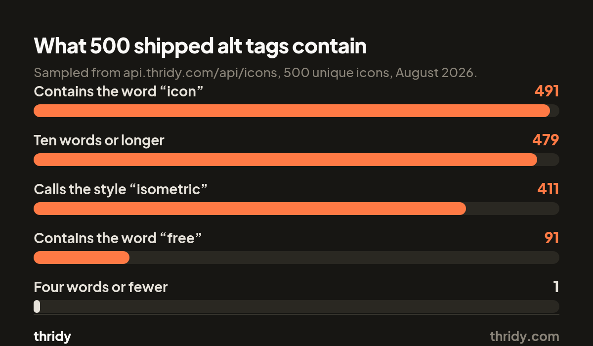
None of that is a bug in a renderer. It is what happens when one field has to serve a catalog page, a search index and a live interface at once. It ends up serving the first two.
A catalog and a button are asking different questions
On an icon detail page, the alt text sits beside a picture of an icon on a page whose entire subject is that icon. "Isometric 3D icon of a shopping cart" is a defensible thing to say there. Someone arrived looking for a shopping cart icon and wants to know what this one looks like before downloading it. The image is the subject.
Drop the same file into your checkout and it is inside a button. The person hearing that button announced does not care about the rendering style, the polygon count or the licence. They need to know that pressing it opens their cart. The image stopped being the subject and became a label on a control.
The W3C's tutorial on functional images states the rule in one line: the text alternative "should convey the action that will be initiated (the purpose of the image), rather than a description of the image". The examples they give are "print this page" rather than "image of a printer", and "search" rather than "magnifying lens".
The rule is what it does, not what it is
WCAG 2.2 splits non-text content by the job it is doing. For controls it asks that "if non-text content is a control or accepts user input, then it has a name that describes its purpose". For decoration it asks the opposite: "if non-text content is pure decoration, is used only for visual formatting, or is not presented to users, then it is implemented in a way that it can be ignored by assistive technology".
So the useful question is never "what is in this picture". It is "if this picture vanished, what would someone lose". Answer that and the alt text writes itself.
Three answers cover almost everything
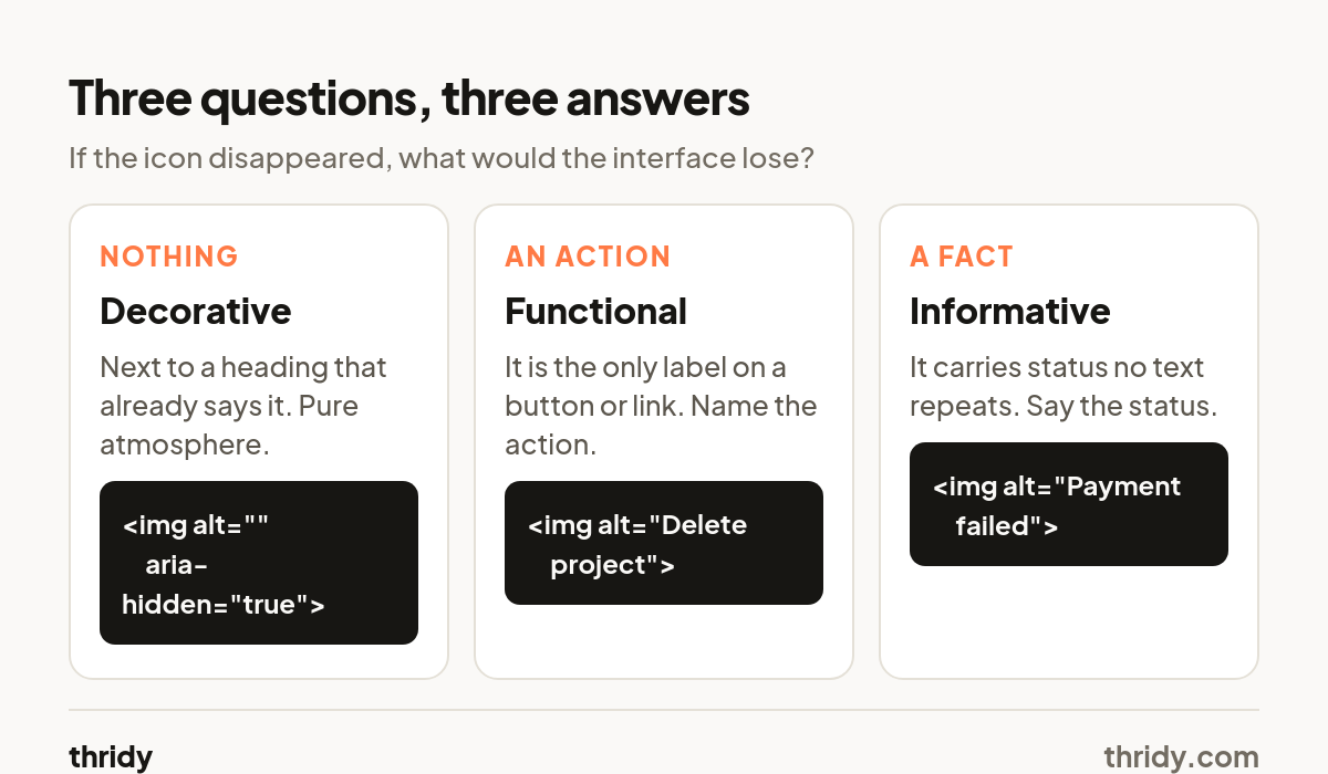
They lose nothing. The icon sits next to a heading that already says "Settings", or it is atmosphere at the top of an empty state. Give it an empty alt: <img src="gear.webp" alt="">. The W3C's decorative images tutorial notes that a null alt is the reliable way to do this, and that role="presentation" is not as widely supported. An empty alt is a decision. A missing alt attribute is not the same thing, and screen readers will often fall back to announcing the file name, which in our case means someone hears "one hundred points eight four four f eight four a a dot webp".
They lose an action. The icon is the only thing inside a button or link. Name the action, not the object: alt="Delete project", not alt="Trash can". If the button already has visible text next to the icon, the icon is decorative again, because the action is already named. Two labels for one control is worse than one.
They lose a fact. The icon is carrying status that no nearby text repeats: a red cross on a failed payment row, a lock on a private document. Say the fact. alt="Payment failed". If the row already says "Failed" in text, empty it out.
The words worth deleting
Start with "icon", "image of", "picture of" and "graphic". An <img> is already announced as an image by assistive technology, so those words buy a repetition and nothing else. 491 of our 500 sampled tags would get shorter on this rule alone.
Then delete the rendering vocabulary: "3D", "isometric", "front-facing", "flat", "premium", "free", "UI". Every one of those describes our production process or our pricing. None of them changes what the listener will do next. That is the whole test.
What is left is usually two to four words, which matches how long the icon's name was in the first place.
Decorative does not mean free
An empty alt hides an icon from assistive technology. It does not hide it from the network, and 3D icons are heavier than the flat sets people are used to budgeting for.
We measured twelve real icons straight off our CDN. The display files run a median of 29.0 KB, from 19.5 KB up to 153.2 KB for one outlier, an education icon with a lot of fine geometry. The smaller variants of the same twelve icons come in at a median of 6.8 KB, which is 22 percent of the display file. Loaded together, the twelve display files total 486 KB against 82.6 KB for the small ones.
So an icon you have correctly marked as decorative can still be the most expensive thing on the row. If it genuinely carries no meaning, it is a good candidate for the small variant, for loading="lazy", or for being cut. Our CDN serves these with a four hour max-age, so a repeat visitor pays once, but the first paint is the first paint.
What we are changing on our side
We are not going to pretend a library can write your alt text, because the correct string depends on a context we cannot see. What we can stop doing is shipping a field that looks like an answer when it is really a catalog caption.
Three changes. The style words come out of the alt field and stay in the description, where they belong and where they are at least consistent. The isometric contradiction gets fixed, since a tag that describes the wrong geometry is wrong for both purposes. And the alt field gets documented for what it is: a catalog caption, safe on a listing page, meant to be replaced in a product.
A five-minute audit of your own build
Open a page and find every icon on it. For each one, ask what someone loses if the image fails to load. If the answer is nothing, empty the alt. If the answer is an action, write the action. If the answer is a fact, write the fact.
Then grep your codebase for alt=" and read the values as a list, with no pictures next to them. Any tag containing "icon", "3D", "image of" or a style word came from a library and never got looked at. Any tag longer than about six words is describing rather than labelling. Any tag that repeats visible text next to it is making a screen reader say the same thing twice.
It is a small pass and it is not glamorous, but it is the difference between an interface that happens to contain icons and one that can be used without seeing them.
Free 3D icons for this
Every icon on Thridy is free to download and use. A few that fit this piece:
- Pineapple Hand Grenade 3D icon
- 35mm Slide 3D icon
- Abandoned Factory 3D icon
- Aboriginal Didgeridoo 3D icon
- US Army Dog Tags 3D icon
- Dog Tags 3D icon
Browse all 2,600+ free 3D icons or explore them by category.