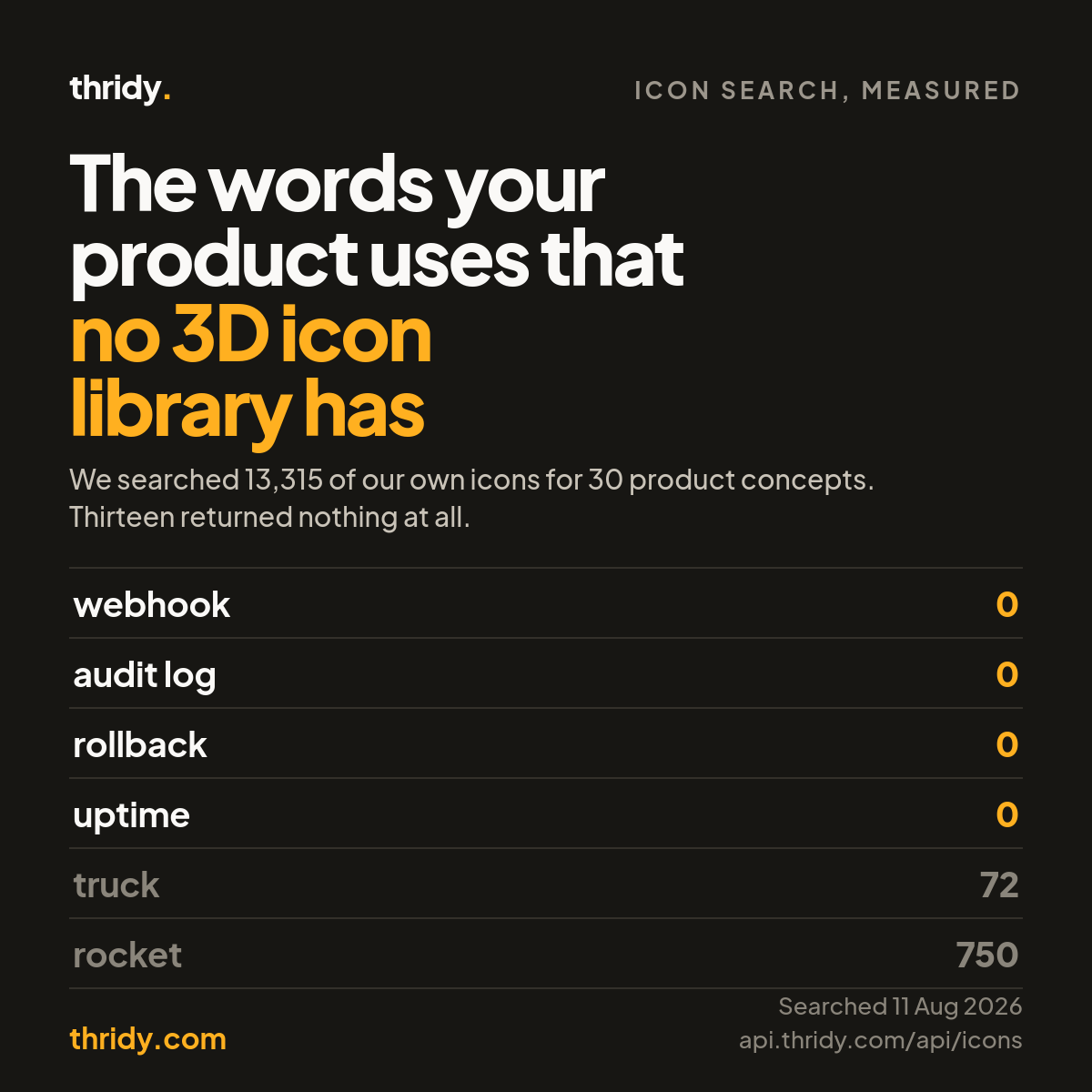
Every icon library looks complete until you build the settings page. Search for a truck and you get seventy-two results. Search for what you are actually shipping this sprint, an integrations page, a webhook log, a two factor prompt, and the panel comes back empty. It is not that you searched badly. It is that a whole class of words your product uses has nothing behind it to draw.
We wanted to know how big that class is, so we measured it against our own library and are publishing the result including the part where we look thin.
What we measured
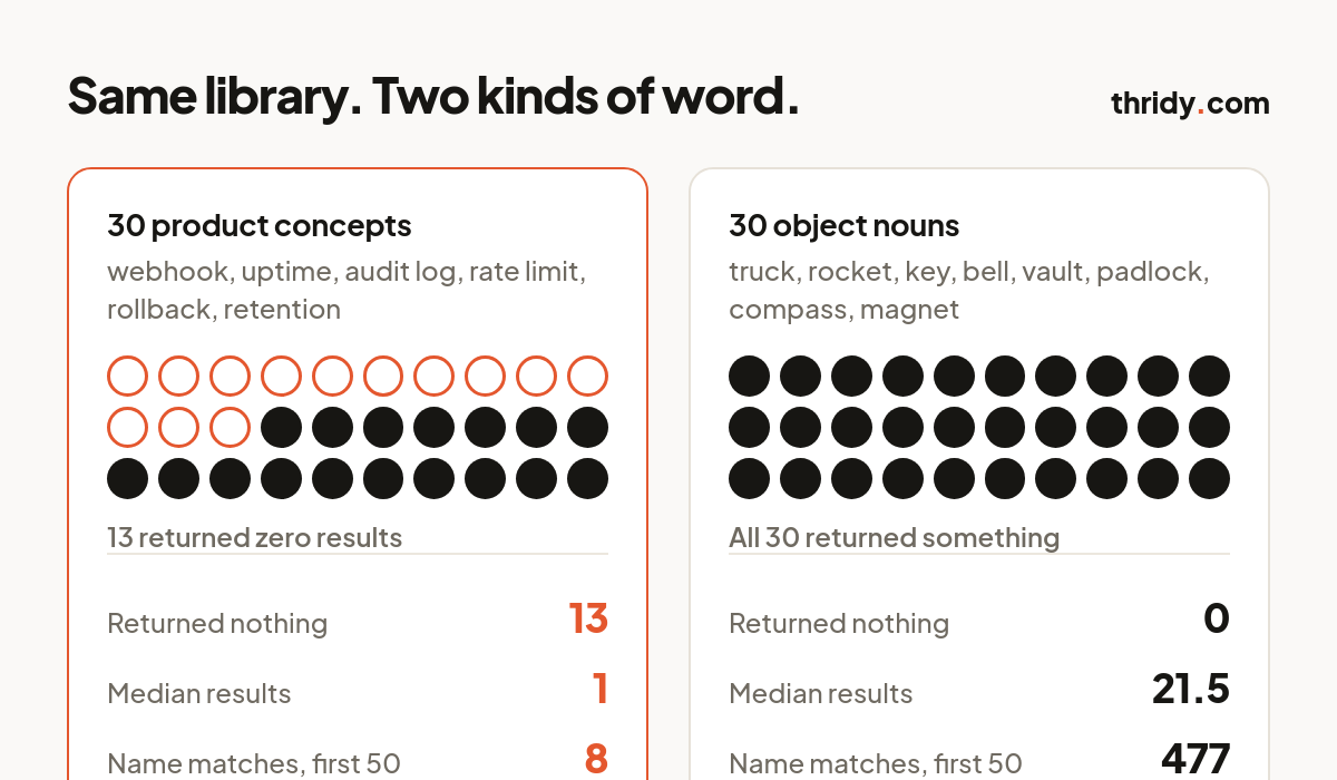
We took two lists of thirty words. The first list is product vocabulary: integration, webhook, uptime, rate limit, audit log, rollback, version control, retention, observability, deployment, permissions, encryption, caching, validation and the rest. These are words that appear in real navigation, real settings screens and real empty states. The second list is ordinary objects: rocket, wallet, truck, key, clock, calendar, bell, padlock, compass, magnet and their kind.
We ran all sixty through our own public search endpoint on 11 August 2026, against 13,315 icons, and recorded two numbers for each word: the result count the API reports, and how many of the first fifty results actually carry the search word in the icon's name. You can rerun any of it yourself, the endpoint needs no key: api.thridy.com/api/icons?limit=50&search=webhook.
Thirteen of the thirty product words returned nothing at all
Integration, webhook, two factor, audit log, latency, uptime, version control, scalability, retention, rate limit, indexing, observability and rollback all returned zero. Twenty-two of the thirty returned fewer than five results. The median result count across the whole list was one. Add up every one of the thirty searches and only eight returned an icon with the word in its name.
The object list, run the same way in the same session, did not have a single zero. Its median result count was 21.5, and across the thirty searches 477 returned icons carried the search word in the name. Same library, same search code, same afternoon. The difference is entirely in the kind of word we typed.
Three of those eight name matches were accidents
Worth looking at what the eight actually were. Authentication, Workflow, Deployment, Privacy Policy and Privacy Shield are genuine. The other three are Butter Churn for churn, Engagement Ring for engagement and Immigration for migration. The search matched a substring, and a substring is not a concept.
Acronyms are worse, because they are short enough to hide inside almost anything. Searching otp returns nine results, led by Footpath and Potpourri. Searching sso returns 641, led by Blossom and Bassoon. Searching cron returns four, led by Cronut and Micronesia. We wrote separately about what icon search does with your words, and the rule from that piece applies doubly here: judge a search by the names on the first screen, never by the total. A non-zero count is not coverage.
The gap is the shape of the medium, not a hole in our backlog
A 3D icon is a rendered object. It has a form, a material and a light source hitting it from somewhere. That is exactly why people reach for the style, and it is exactly why it cannot draw a rate limit. You can render a truck because a truck has a shape. Rollback does not have a shape. It has a definition.
You can see that bias in how the library is built. Counting each of the 13,315 icons once under its primary category: Food and Drink 1,456, Animals 1,265, Transportation 1,033, Places and Architecture 943, Nature and Plants 790. UI and Interface has 239, and Symbols has 320. Under five percent of the library is native interface vocabulary. The rest is things that exist in the world. That ratio holds across every 3D set we have looked at, ours included, and no amount of drawing fixes it, because the missing icons are not objects anyone has ever seen.
Search the object, not the feature
The practical move is to do the translation yourself before you type. Your feature has a name, and somewhere behind that name is a physical thing your reader already associates with it. Search for the thing.
Integration returns nothing. Puzzle Piece, Electric Plug and Link all exist. Webhook returns nothing, but Electric Plug and Conveyor Belt do the same job. Two factor returns nothing, while Fingerprint Scanner, Locked Padlock and Key are all there. Audit log returns nothing, and Logbook, Clipboard and Stamp are sitting in the library waiting. Rate limit maps onto Traffic Light, Funnel or Hourglass. Uptime maps onto Pressure Gauge or Radar. Rollback maps onto Rewind Button. Version control maps onto Olive Branch. Retention maps onto Magnet. Deployment maps onto Rocket, which returns 750 results because rockets are objects and objects are what this medium has.
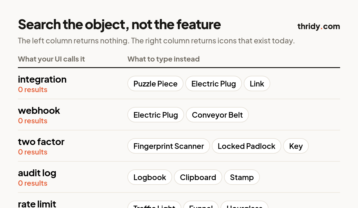
Two habits make this reliable. Pick the object once per concept and use the same one everywhere in the product, because a metaphor that changes between the sidebar and the empty state is worse than no metaphor. And prefer the boring object over the clever one. Nobody has to decode a padlock.
When the object is a stretch, put a word next to it
Sometimes the translation does not land, and the honest answer is that no picture will carry the meaning by itself. Nielsen Norman Group's guidance on icon usability is blunt about this: a text label must be present alongside an icon to clarify its meaning, and if you find yourself having to ponder to come up with an icon for something, it is probably not going to be recognisable to your users either.
Take that as a decision rule. If it took you more than a few seconds to choose the object, your user is not getting there in a glance, so ship the label and let the icon do what it is genuinely good at: making the row a bigger target, marking the place on a page people scan, and carrying the tone of the product. A labelled Conveyor Belt next to the word Webhooks works. An unlabelled one is a puzzle.
The ten minute test before you commit to a library
Do this before you standardise on any icon set, ours or anyone else's. Write down twenty words from your own product, taken from the navigation, the settings screens and the empty states, not from a generic list. Search each one. Ignore the reported total and read the first ten names. Mark each word as found, translatable or dead. For everything not found, do the object translation and search again. Whatever is still dead after translation is a design decision you now get to make calmly, with a label or a flat icon or a piece of illustration, rather than at four in the afternoon on the day the feature ships.
The libraries that will disappoint you are not the small ones. They are the ones that look enormous and are enormous in exactly the categories your product never mentions. Thirteen thousand icons of food, animals and vehicles will not draw your audit log, and twenty searches will tell you that in less time than it takes to install the package.
Free 3D icons for this
Every icon on Thridy is free to download and use. A few that fit this piece:
- UX Designer 3D icon
- UX Designer Avatar 3D icon
- Blue UX Designer 3D icon
- Alarm Clock 3D icon
- Assembly Line 3D icon
- Assembly Robot 3D icon
Browse all 2,600+ free 3D icons or explore them by category.