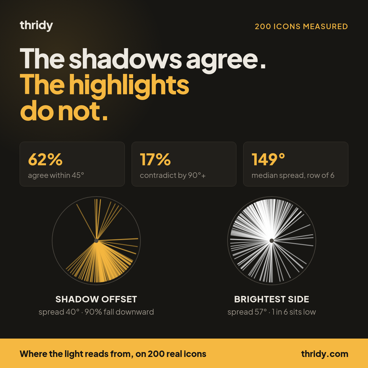
Pick six 3D icons for a dashboard nav. Open each one on its own at full size and every one is fine: clean modelling, sensible colour, sharp edges. Put them in a row at 48px and something is off. Nothing you can point at. The set just does not read as a set.
One cause is projection, which we have written about in Two Projections, One Icon Row. This piece is about the other one: light. A 3D icon is a render, and a render bakes its lighting into the pixels. Where the light came from is not a property you can change later. It is in the file, the same way the colour is.
So we measured it across our own library, and the result split cleanly in two. The shadows are consistent. The bright side of the object is not.
What we measured
We took 200 icons at random from a pool of 982 pulled across 20 evenly spaced pages of our icons API, so the sample is not one alphabetical slice and not one category. Our library holds 13,332 icons. For each of the 200 we downloaded the 512px WebP from our CDN and worked on the actual pixels.
We split each image into two parts by alpha: the solid object, at alpha 200 or above, and the soft halo around it, at alpha between 20 and 180, which is where a baked drop shadow lives. Then we took two independent measurements.
Shadow offset. The centre of the soft region relative to the centre of the object. An icon whose shadow is cast down and to the right gives a vector pointing down and to the right.
Brightest side. We fit a plane to the luminance across the object and took the direction in which brightness increases. As a cross-check we separately took the centroid of the brightest 3% of pixels. The two methods landed within 45 degrees of each other on 69% of icons, with a median disagreement of 26 degrees, which tells us we are measuring a real property of the image rather than noise.
Both produce an angle, and angles need circular statistics. Where we say "spread" below we mean circular standard deviation: 0 degrees would mean every icon points identically, and a bigger number means a wider scatter.
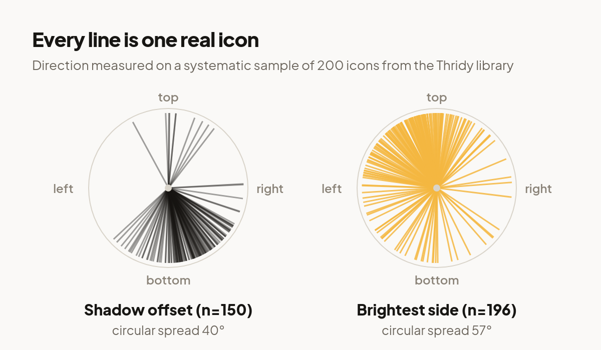
The shadows agree
150 of the 200 icons had a shadow offset far enough from centre to measure. Of those, 90% fall downward, in the arc between down-left and down-right. The mean direction is down and very slightly right. The spread is 40 degrees.
That is tight. Put any two of these icons side by side and their shadows will almost always be going the same way. This is the part of the library that behaves.
The brightest side does not
196 icons had a brightness gradient strong enough to read. The spread is 57 degrees, half again as wide as the shadows.
The bulk of it is where you would expect. Counting by eighth of a circle, out of 196 icons: 76 are brightest toward the top, 56 toward the top-left, 20 toward the left, 13 toward the top-right. That is 82% of the library brighter somewhere above the middle, which matches the convention almost every 3D artist works to.
The rest do not follow. 12 icons are brightest toward the bottom-left, 11 toward the bottom, 5 toward the bottom-right, 3 toward the right. Roughly one icon in six has its bright side low.
Where the two measurements disagree, look at the object
A shadow falling one way implies light arriving from the other. On the 149 icons where we could measure both, we compared the brightest side against the direction the shadow implies. They agree within 45 degrees on 62% of icons, with a median disagreement of 32 degrees. But 17% contradict each other by more than 90 degrees.
We opened those and looked. They are not badly lit renders. They are objects whose own material is pale at the bottom:
ceiling-fan reads 176 degrees away from what its shadow implies, because the glass light bowl hangs below the hub and is the brightest thing in the frame. platform-sandals-2 is off by 167 degrees: the sole is white and the sole is at the bottom. flea, automotive-detailer and molecule tell the same story, a bright element sitting low in the composition.
This is worth knowing because it changes what you look for. The eye does not separate "this part is lit" from "this part is painted white". A bright shape low in the frame reads as light coming from below no matter what the render was doing, and that is what puts an icon out of step with the row it sits in.
A row of six spans 149 degrees
On its own, none of this shows. In a row it does, because a row invites comparison.
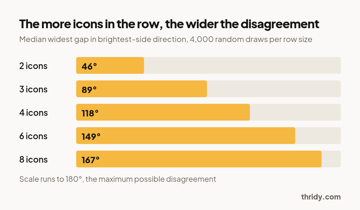
We simulated the case directly. Draw a set of icons at random from the measured pool, then take the widest disagreement in brightest-side direction between any two of them, 4,000 draws per set size.
Two icons: a median of 46 degrees. Three: 89 degrees. Four: 118. Six: 149. Eight: 167, close to the 180 degree ceiling.
For a row of six, 80% of draws exceed 90 degrees and 59% exceed 135. Put plainly: pick six icons at random out of a large 3D set and it is more likely than not that two of them will look lit from opposite sides.
Staying inside one category helps, but not evenly
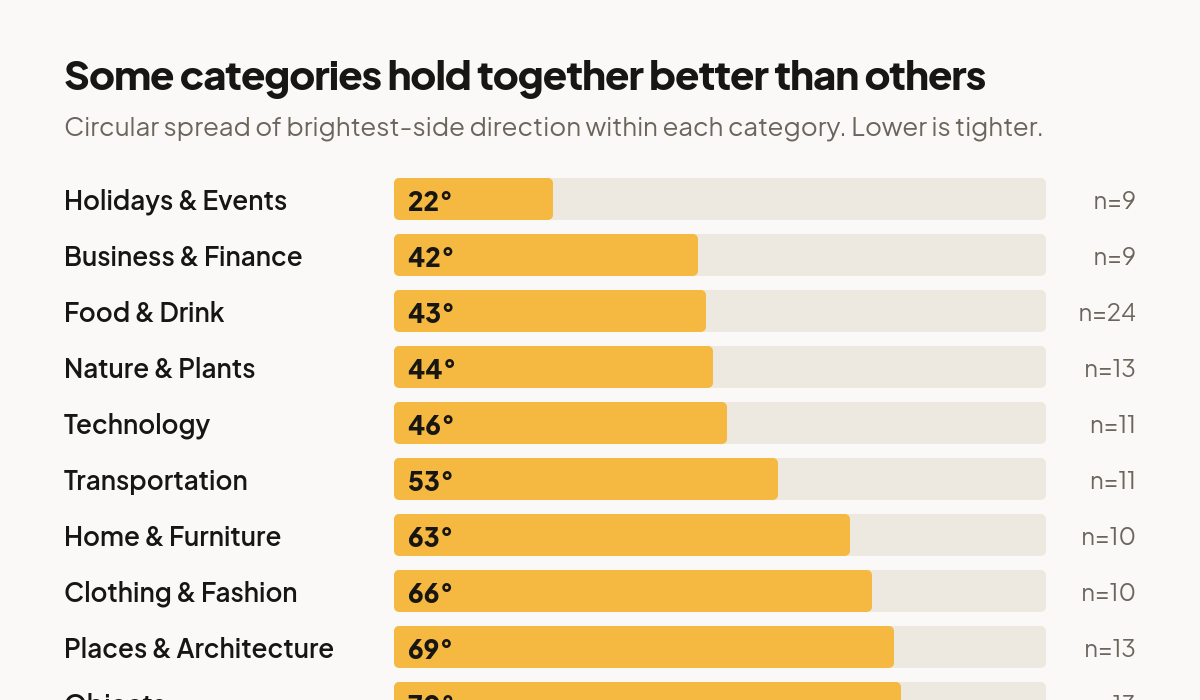
The obvious mitigation is to draw a set from one category and hope the icons were made together. It helps, and how much depends heavily on the category.
Measured within each category, the spread runs from 22 degrees for Holidays & Events up to 78 degrees for Animals, which is wider than the library as a whole. Business & Finance sits at 42, Food & Drink at 43, Nature & Plants at 44, Technology at 46. Home & Furniture, Clothing & Fashion, Places & Architecture and Objects all land between 63 and 70.
These are small samples inside a 200-icon draw, between 9 and 24 icons each, so treat the ordering as a hint rather than a ranking. The pattern behind it is not subtle though. Categories of upright, manufactured, single-material objects hold together. Categories of organic or irregular things do not, because the shape of the thing decides where the bright part lands.
You cannot fix this in CSS
Worth saying because it is the first thing people try. The W3C Filter Effects spec defines brightness() as applying "a linear multiplier to input image". It scales every pixel by the same factor. It makes a bright icon brighter and a dark icon darker, and it cannot move where the bright part is. Neither can contrast(), saturate() or hue-rotate(). Baked light is baked.
drop-shadow() is the one exception, and only for the shadow: you can add a cast shadow of your own on top. But our shadows are the consistent half of this problem already, so that is rarely the thing worth fixing.
What to do instead
Judge the set, not the icon. Every icon we measured looks correct alone. The defect only exists in comparison, so build the row before you commit to it.
Scan for pale bottoms. Lamps, screens, white soles, glass bowls, anything emissive or light-coloured sitting low in the frame. Those are the icons that will fight a row of ordinary solid objects, and they are far easier to spot once you know to look.
Use the shadow as your anchor. It is the cue that is already consistent across the library and the one that survives at small sizes, where a highlight is only a few pixels wide. If you are compositing icons into a scene of your own, match your scene's light to the shadow direction, down and slightly right, and most of the set will agree with you.
Swap, do not correct. When an icon is lit against the grain, the fix is a different icon, not a filter. With 13,332 to choose from there is usually a near neighbour that behaves.
Check at the size you ship. At 24px this mostly stops mattering, because there is not enough of the highlight left to read. At 48px and above it matters, and at 64px and up it is obvious once you have seen it.
How to run this on any icon set
Nothing here needed a 3D tool. Load the PNG or WebP with alpha, mask to pixels above alpha 200, compute luminance, then least-squares fit brightness against x and y across those pixels. The sign of the two coefficients is your light direction. Run it over a set, convert to angles, and take the circular standard deviation. Under 45 degrees and the set will hold together. Over 60 and it will not, and now you know why before anyone on your team has to explain what feels wrong about it.
Free 3D icons for this
Every icon on Thridy is free to download and use. A few that fit this piece:
- Blog Post 3D icon
- WebP File 3D icon
- Pig 3D icon
- Scarf 3D icon
- UX Designer 3D icon
- PLUS icon for UI 3D icon
Browse all 2,600+ free 3D icons or explore them by category.