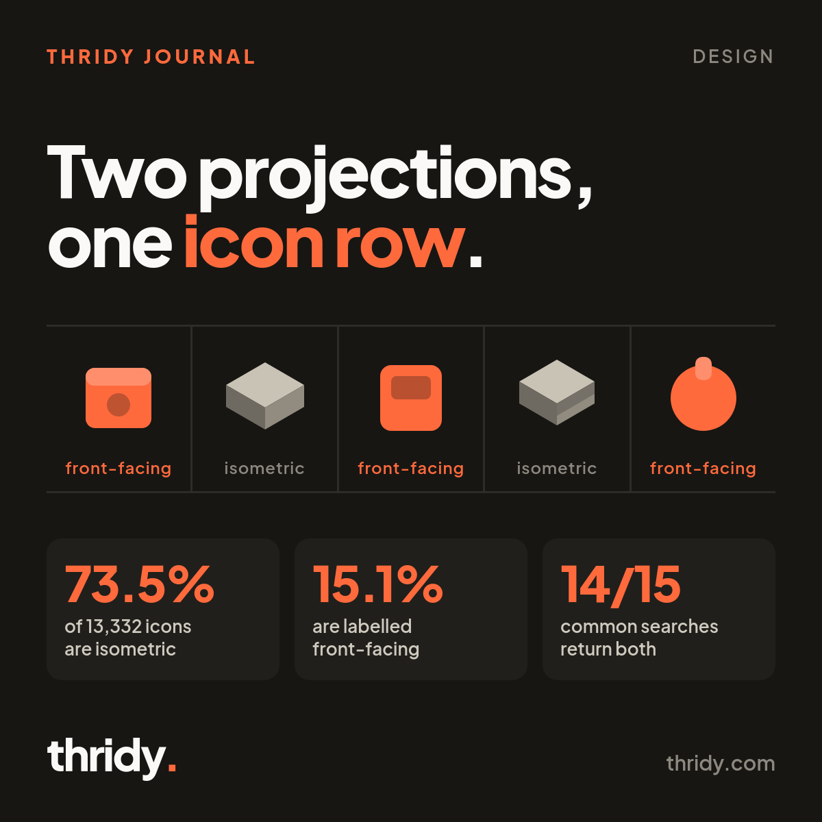
You pick eight icons for a dashboard sidebar. The sizes match, the spacing is on the grid, the colours come from the same family. The row still looks wrong, and nobody on the team can say why in a code review.
Often the problem is not size and not colour. It is that some of those icons are drawn as if you are looking at them head on, and some are drawn as if you are looking down at them from a corner. Two camera positions in one line of interface. The eye catches it long before anyone can name it.
We wanted to know how often that trap is set by our own library, so we classified every icon on Thridy and then measured a sample of the actual image files. There are 13,332 icons in the library as we write this. Roughly three quarters of them are drawn from a corner, and almost every common search hands you a mix.
Two camera positions, one grid
An isometric icon is drawn in axonometric projection. Wikipedia's definition is precise: the three coordinate axes appear equally foreshortened, and the angle between any two of them is 120 degrees. In practice it means you see the top face and one or two side faces of an object at once, as if you were floating above and to one side of it. A parcel becomes a visible box with a lid. A phone lies at an angle with its edge showing.
A front-facing icon puts one face toward the viewer. Depth is still there, in a bevel, a thickness, a soft shadow, but the object is squared up to the camera. A padlock looks like a padlock you are standing in front of.
Both styles are fine. Neither is more modern or more correct. The problem is only ever mixing them inside one visual group, because a group of icons implies a single viewpoint, and two viewpoints in one row reads as an error in the group rather than a difference between two files.
Three quarters of the library is isometric
Every Thridy icon carries a description written when the icon was added, and those descriptions name the style. We pulled all 27 pages of the public icons endpoint and sorted 13,332 records by what their own description says.
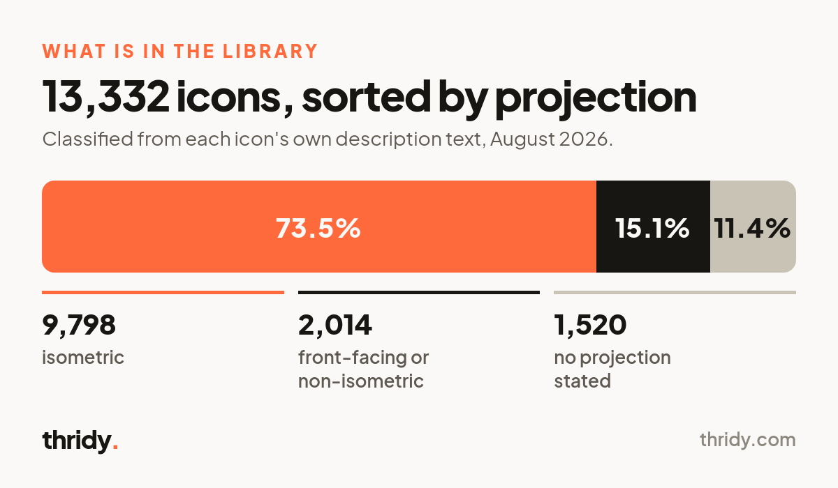
9,798 icons, 73.5 percent, describe themselves as isometric. 2,014, 15.1 percent, describe themselves as front-facing or explicitly non-isometric. The remaining 1,520, 11.4 percent, do not say either way. So the library has a clear house style and a substantial minority that departs from it. If you assume everything matches because it all came from one library, you will be right about three times in four, which is exactly often enough to stop checking.
One search, both answers
The split only matters if a designer meets both sides of it in one sitting. So we ran 15 searches for words a product team actually types, and looked at the first 12 results of each: settings, user, search, cart, notification, wallet, chart, calendar, cloud, lock, message, home, camera, folder, phone.
Fourteen of the fifteen returned both projections in the top 12. The only one that did not was home, where the first 12 results were 10 isometric icons and 2 with no style stated.
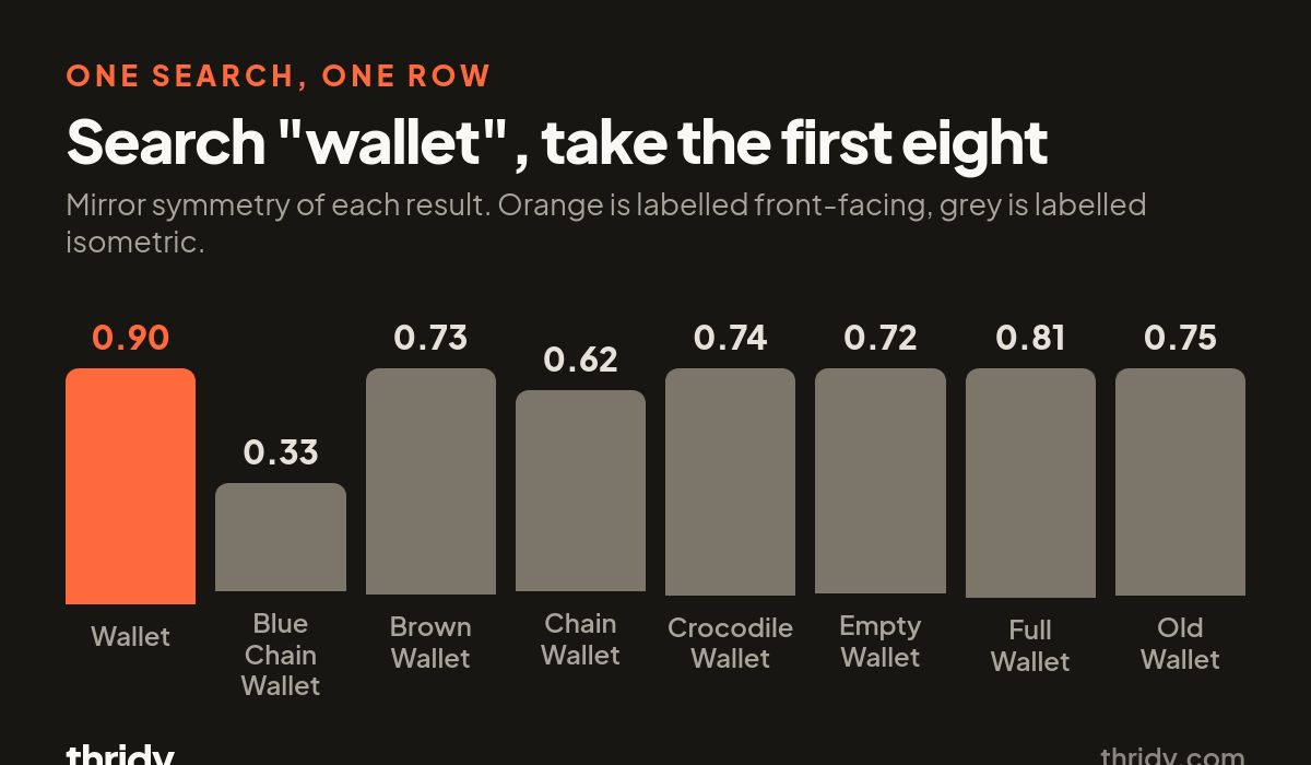
The mix is rarely even, which is what makes it easy to miss. Searching message gives 11 isometric icons and 1 front-facing. Searching cloud, camera, phone, wallet and notification each gives 10 isometric and 1 or 2 front-facing. Pick the first result you like and you will probably land on an isometric icon, but the one exception is sitting right beside it in the same grid.
Then the ratio flips without warning. Searching settings returns 9 front-facing icons and only 3 isometric ones in the top 12. A team that has been picking isometric icons all afternoon will hit the settings row and, following the same habit of taking the first good match, walk straight into the minority style.
We checked the descriptions against the pixels
A label in a description field is a claim, not evidence. So we tested it against the images.
Front-facing icons of ordinary objects tend to be close to mirror-symmetric about their vertical axis. Isometric icons almost never are, because a corner view shows more of one side than the other. That gives a cheap measurement: take the icon's alpha channel, crop to the silhouette's bounding box, flip it horizontally, and compute the overlap between the shape and its own reflection as intersection over union. A perfectly symmetric silhouette scores 1.00.
We sampled 120 icons, 60 labelled isometric and 60 labelled front-facing, spread evenly across the alphabetical slug order so we were not cherry-picking, and downloaded each 512 by 512 WebP from the CDN.
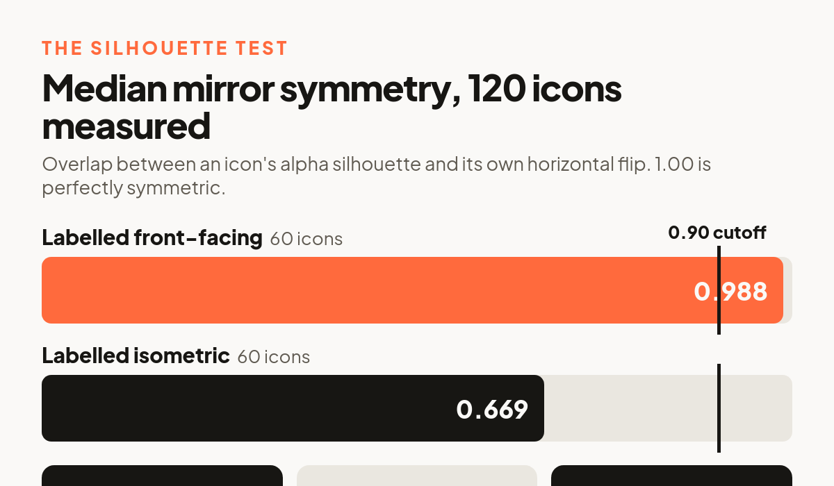
The two groups separate cleanly. Median mirror symmetry is 0.988 for the front-facing group and 0.669 for the isometric group. Using 0.90 as a cutoff, 48 of the 60 front-facing icons score above it and only 10 of the 60 isometric ones do. The descriptions are telling the truth, and the difference is visible in the shapes themselves, not just in the words attached to them.
Where the silhouette test fails
It is a proxy, and we would rather say where it breaks than let you find out on your own work.
It fails on objects that have no natural front. Among the icons labelled front-facing, Saxophone scores 0.361, U Turn Arrow 0.456, and the map outlines of Russia and Tanzania score 0.620 and 0.605. None of these are drawn from a corner. They are simply asymmetric objects photographed straight on, and a symmetry test cannot tell that apart from a corner view.
It also fails in the other direction, on objects that look the same from every angle. Biosphere scores 0.994, Classic Red Giant 0.991 and Brown Wine Barrel 0.984, all of them labelled isometric. A sphere viewed from a corner is still a circle.
So the number is a screening tool for a set, not a verdict on a single file. Run it across a batch and a bimodal distribution tells you the batch mixes projections. Run it on one saxophone and it tells you nothing.
What we would do with this
Pick a projection per surface, not per icon. Navigation, tab bars and dense lists are where mismatches are most visible, because the icons sit close together at small sizes and the eye compares them directly. Empty states, marketing pages and onboarding illustrations are far more forgiving, since each icon is usually alone.
Read the description before you download. Every icon on Thridy states its style in the description text on its detail page, and on the public API in the description field. It is one word, and it is the cheapest check available.
Audit what you already shipped. If you have a folder of icons collected over a year, run the symmetry measurement across all of them. Anything that clusters well below the rest of the batch is worth looking at by eye.
Do not reach for a transform to fix it. Skewing a front-facing icon does not turn it into an isometric one. It gives you a front-facing icon that has been leaned over, with lighting and shadow that still belong to the original view. Replacing the icon is faster and looks better.
How we measured this
The library counts come from the public icons endpoint at api.thridy.com, pulled as 27 pages of 500 records on 17 August 2026, deduplicated by slug to 13,332 icons. Classification is a keyword match on each icon's own description field: isometric, front-facing, front facing, non-isometric. An icon that says non-isometric is counted as front-facing, not isometric.
The search results come from the same endpoint with a search term and a limit of 12, one request per term, no reranking on our side.
The symmetry figures come from the 512 by 512 display WebP files on cdn.thridy.com. We loaded each into Pillow, thresholded the alpha channel at 50 percent, cropped to the silhouette's bounding box, flipped it horizontally and divided the intersection by the union. Every number in this article came out of one of those three steps. None of it is from memory, and you can reproduce all of it against the same public endpoints.
Free 3D icons for this
Every icon on Thridy is free to download and use. A few that fit this piece:
- Red Rocket 3D icon
- Percentage 3D icon
- Pineapple Hand Grenade 3D icon
- 35mm Slide 3D icon
- Abandoned Factory 3D icon
- Aboriginal Didgeridoo 3D icon
Browse all 2,600+ free 3D icons or explore them by category.