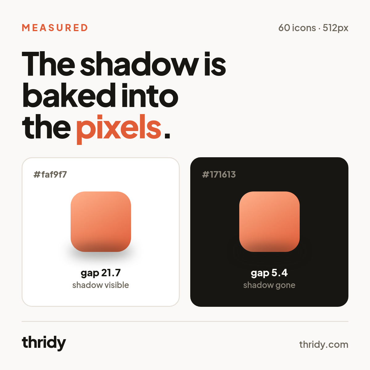
Take a row of 3D icons that reads perfectly on a near-white settings page and drop it into a dark card. The icons are still there. They just stop sitting on anything. We wanted to know exactly what goes missing, so we decoded 60 icons from our own CDN and looked hard at the pixels that are neither fully solid nor fully empty. That band turns out to be between a seventh and four fifths of everything you can see, and most of it is a drop shadow rendered on the assumption of a light page.
How we measured this
We ran 20 searches against our public icons endpoint and kept the first three results from each, which gave us 60 icons spread across Technology, Nature & Plants, Food & Drink, Clothing & Fashion, Objects and more. Every display file is a 512x512 RGBA WebP served from cdn.thridy.com. We decoded each one to raw pixels and bucketed every pixel by its alpha value: 0 is fully transparent, 255 is fully opaque, and anything in between is partial.
Then we composited each icon onto real backgrounds using the source-over formula from the W3C Compositing and Blending specification, co = Cs x as + Cb x ab x (1 - as), and measured what changed. For brightness we applied the Rec. 709 luma weights to the sRGB values, so every brightness figure below sits on the same 0 to 255 scale rather than being a WCAG relative luminance. Every number in this article came out of that run, and where we name an icon we measured that specific file.
We have decoded these icons before, when we checked their contrast in dark mode. That run kept only pixels with an alpha of 128 or higher and discarded the rest. This article is about the pixels we discarded.
Most of what you can see is not solid
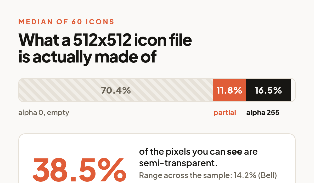
Across the 60 files, the median icon spends 70.4% of its 512x512 canvas on fully transparent pixels, 16.5% on fully opaque pixels, and 11.8% on pixels somewhere in between.
The comparison that matters is the second figure against the third. Of the pixels you can actually see, meaning everything with any alpha at all, a median of 38.5% are partially transparent. The spread is wide: Bell is 14.2%, Lock Pick is 79.6%. For most icons in the sample, more than a third of the visible artwork is a blend of the icon and whatever you put behind it.
That is not an edge case you can design around by squinting at a mockup. It is how the format normally behaves.
The soft band is a shadow, and it points down
Antialiasing would explain a thin partial-alpha rim. It would hug the silhouette evenly in every direction. That is not what the pixels show.
We isolated the faint band, every pixel with an alpha between 5 and 80, and compared where it sits against the fully opaque body. In 58 of the 60 icons the faint band's centre of mass sits below the body's centre of mass, by a median of 101 pixels on a 512 pixel canvas. It is also darker than the body: median brightness 69 against 135 for the opaque pixels. And a median of 14.2% of those faint pixels lie entirely below the lowest opaque row of the icon, in one case 85% of them.
Faint, dark, offset downward, and partly detached from the object. That is a contact shadow, baked into the file as pixels. You cannot turn it off, and it does not know what is behind it.
The shadow was rendered for a light page
A shadow only exists as a difference from its background, so we composited the faint band onto three real backgrounds and measured the gap.
On #faf9f7, our light background at brightness 249, the shadow region resolves to 227. A gap of 21.7 levels, which is what a soft shadow is supposed to look like. On #171613, our dark background at brightness 22, the same pixels resolve to 27. A gap of 5.4. On a saturated brand blue, #2563eb at brightness 96, they resolve to 92. A gap of 3.6.
Nothing is broken. The shadow is simply spending its entire contrast budget against a background you are no longer using. Move a 3D icon off a light surface and the shadow does not look wrong, it stops being visible at all, and the icon loses the thing that made it look placed rather than pasted.
The whole icon shifts too, not just the shadow. Swapping #faf9f7 for #171613 changes the average visible pixel by 17.5 levels out of 255, and moves more than 10 levels on a median of 10.3% of visible pixels. Lock Pick, the most translucent icon in the sample, changes by 59.4 levels on average. Tree, one of the most solid, changes by 2.8. Two icons in the same row can respond to a theme switch by an order of magnitude differently.
The shadow moves your alignment as well
Because the shadow is part of the image, the file's visible bounding box is not the icon's bounding box. We measured both: the box around every pixel with alpha above zero, and the box around the solid body at alpha 128 and up.
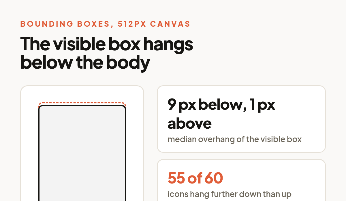
The visible box extends a median of 9 pixels below the body and 1 pixel above it, on a 512 pixel canvas, and it skews downward on 55 of the 60 icons. So the optical centre of the artwork sits a median of 4 pixels higher than the centre of the file. At a 48 pixel render that is under a pixel for most icons, which is fine. For the outliers it is not: Lock overhangs by 46 pixels and Bell by 44, roughly 4 pixels at a 48 pixel render. Put those next to a tight icon like Tree, which overhangs by 1, and centring every file inside the same box leaves one body visibly high.
If a row of icons looks subtly unaligned and you have already checked your padding, this is a likely reason. The fix is to align on the body, not on the file.
If you generate your own sizes, premultiply
There is a trap in this that has nothing to do with design. In these files the fully transparent pixels still carry a colour, and it is close to black: mean RGB values of 3 to 7 across our sample. That is normal and harmless, until something resizes the four channels independently.
We downscaled all 60 icons from 512 to 32 pixels twice: once naively, resizing RGBA directly, and once correctly, multiplying colour by alpha first and dividing it back out afterwards. Composited onto white, a median of 7.4% of the pixels differ by more than 5 levels, the worst single pixel in a typical icon differs by 49 levels, and the largest we saw was 61. Every icon we checked came out darker on the naive path, because the near-black in the transparent region bleeds into the edge.
Browsers do this correctly when they scale an img, so the risk is not in your CSS. It is in build scripts and image pipelines that resize with a general purpose library. The simpler fix is not to resize at all: every icon in the library lists embed sizes of 32, 64, 96, 128, 256 and 512, so ask for the one you need.
What we would actually do
Put the light behind the icon rather than behind the page. A pale plate or chip under each icon on a dark surface gives the baked shadow something to be a shadow against, and it costs one container.
If you would rather not add a plate, add your own shadow in CSS. We checked whether the baked shadow would contaminate a filter: drop-shadow(), since that filter reads the whole alpha channel including the faint band. It contributes a median of 1.2% of the alpha mass and 5.3% at worst, so the new shadow traces the body, not the old shadow. This works.
Do not place 3D icons directly on a saturated brand colour and expect the shadow to survive: a gap of 3.6 levels is nothing. And never assume the file is a solid rectangle. More than a third of the visible pixels are letting your background through, which is exactly what you want when the background is chosen deliberately, and exactly what surprises people when it is not.
None of this is a flaw in 3D icons. It is what a raster image with a baked shadow does. It is worth knowing before you ship a theme toggle.
Free 3D icons for this
Every icon on Thridy is free to download and use. A few that fit this piece:
- Shadow Cape 3D icon
- Shadow Lantern 3D icon
- Shadow Mask 3D icon
- Shadow Puppet Kit 3D icon
- KYC 3D icon
- Pineapple Hand Grenade 3D icon
Browse all 2,600+ free 3D icons or explore them by category.