A 3D icon does not shrink, it dissolves
Put any 3D icon on a slide at 200 pixels and it reads as a small object sitting on the page: a lit side, a shadow side, a soft contact shadow underneath. Put the same file in a sidebar at 20 pixels and it reads as a colored smudge that used to be something. The outline is still correct. Everything that made it worth rendering in 3D has gone.
Where that changeover happens is the one decision that determines whether a 3D icon set makes your product look considered or slightly cheap, and most of the advice about it is vibes. So we measured it. We took 22 of our own icons, rendered each one at nine sizes, and counted what survived at every step down.
What we measured
We pulled 22 icons that a real product would ship together from our own API: settings, gear, user, folder, mail, envelope, search magnifier, calendar, bell, lock, shopping cart, charts, home, camera, trash can, rocket, magnifying glass, clock, bar chart, graph, notification and star. Then we downloaded each display file from our CDN. Twenty are 512 by 512 WebP and two are 1024, ranging from 19.3 KB to 128.7 KB with a median of 24.1 KB.
For each icon we cropped the transparent margin away, padded the artwork back out to a square, and resized it with Lanczos filtering to 16, 20, 24, 32, 48, 64, 96, 128 and 256 pixels. At each size we counted three things. Opaque pixels: pixels with alpha at or above 250 of 255, meaning fully solid artwork. Detail steps: neighbouring pairs of opaque pixels whose luminance differs by more than 12 of 255, which is a countable stand-in for the edges, facets, bevels and highlights inside the shape. Edge pixels: visible pixels that are partly transparent, the antialiased fringe that blends into whatever sits behind the icon.
Every figure below is a median across the 22 icons, and every size is artwork pixels rather than box pixels. Because we cropped the margin off first, these are best-case numbers. In a real layout you hand the icon a box and the artwork fills only part of it: across this set the ink box runs from 56% to 84% of the canvas width, median 71%, so a 24 pixel box typically renders about 17 pixels of artwork. We wrote about that margin separately in Same Box, Different Sizes.
The outline holds, the inside collapses
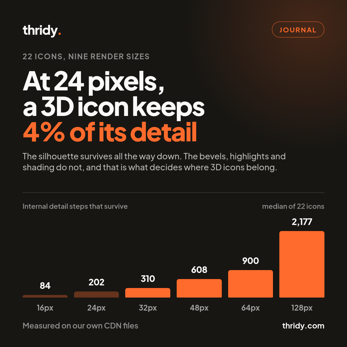
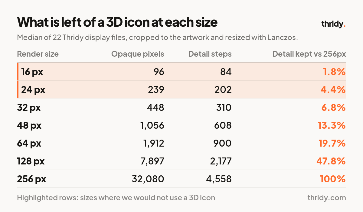
The detail step count is the number that moves. At 256 pixels the median icon carries 4,558 internal detail steps. At 128 it has 2,177. At 64 it has 900. At 32 it has 310, and at 24 it has 202, which is 4.4% of what the artwork started with. Halving the size does not halve the detail, it takes roughly three quarters of it, because detail lives in area and area falls with the square.
What does not collapse is recognisability. We composited every icon on white, converted to grayscale, normalised each render to a common grid and compared every icon against every other one. The median difference between two different icons is 45.3 levels at 128 pixels and 40.1 at 16 pixels, only 11% narrower. Folder and envelope are the closest pair in the set at every single size, and they are no more confusable at 16 pixels than at 128.
That result is the whole point. Small 3D icons do not become wrong, they become generic. You keep the shape that says "this is the mail one" and you lose the rendering you paid for. A separate check makes the same point from the other direction: downscale an icon and blow it back up to 256, and the average error against the true 256 render is 2.8 levels from 128, 5.3 from 64, 11.1 from 24 and 14.3 from 16. Every one of those levels is surface information that no longer exists in the file the browser is drawing.
At 24 pixels you are drawing with 239 pixels
The other half of the story is how little material is actually on screen. At 24 pixels the median icon is 239 fully opaque pixels. At 16 it is 96. That is the entire budget for a bevel, a highlight, a shadow side and a colour.
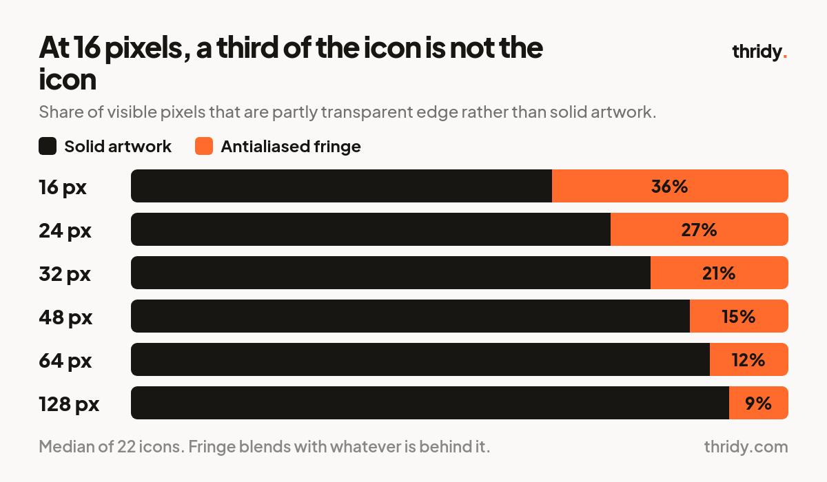
Worse, a growing share of what is visible at small sizes is not solid at all. The partly transparent fringe accounts for 9% of the icon's visible pixels at 128 pixels, 12% at 64, 15% at 48, 21% at 32, 27% at 24 and 36% at 16. At 16 pixels, more than a third of your icon is a blend with the background rather than the icon itself. This is why small 3D icons look acceptable on white and go muddy on a coloured or dark surface: on white the fringe disappears into the page, everywhere else it is visible haze around a shape that had no detail left to spare.
Where the floor actually is
The curve has two knees and they set the bands we now design to.
64 pixels and up. 900 detail steps, 12% fringe. The icon reads as a rendered object with a light source. Above 96 pixels the fringe share flattens at around 9% and you are mostly buying resolution rather than legibility.
40 to 48 pixels. The working minimum. At 48 pixels you still have 608 detail steps and 15% fringe, roughly double the detail of 32 pixels. Form and material survive, fine surface work does not.
32 pixels. Silhouette plus colour, 310 detail steps. Usable when the shape is simple and distinctive, and only when nothing in the icon depends on an internal feature. A gear still reads. A dashboard with three tiny bars in it does not.
24 pixels and below. Do not use a 3D icon. Use a flat or line icon designed for the size. You will ship a sharper interface and a smaller page.
One thing this does not mean: that you cannot have small controls. The W3C's WCAG 2.2 sets Success Criterion 2.5.8, Target Size (Minimum), at 24 by 24 CSS pixels at Level AA. That is the size of the pointer target, not the artwork inside it. A 20 pixel icon centred in a 28 pixel button satisfies the criterion. It is a floor for the button, not permission to render 3D at 20 pixels.
Screen density pushes the other way, and in your favour. As MDN describes it, devicePixelRatio is the number of physical pixels used to draw one CSS pixel: 2 on Retina-class displays and above 2 on many modern phones. A 32 CSS pixel icon on a 3x phone is 96 real pixels of artwork, which lands in the comfortable band. The same 32 pixel icon on a 1x desktop monitor is 32 real pixels and is not. Judge the size in device pixels, not CSS pixels, and remember your desktop users are the hard case.
The file you serve is the other half of the job
Once you know the size you need, the question is which file to send. We checked whether our CDN would resize on request and it does not: fetching dicons/settings.webp?w=64 returns the same 28,282 bytes as the plain URL. Whatever file you reference, the browser downloads all of it and does the scaling itself.
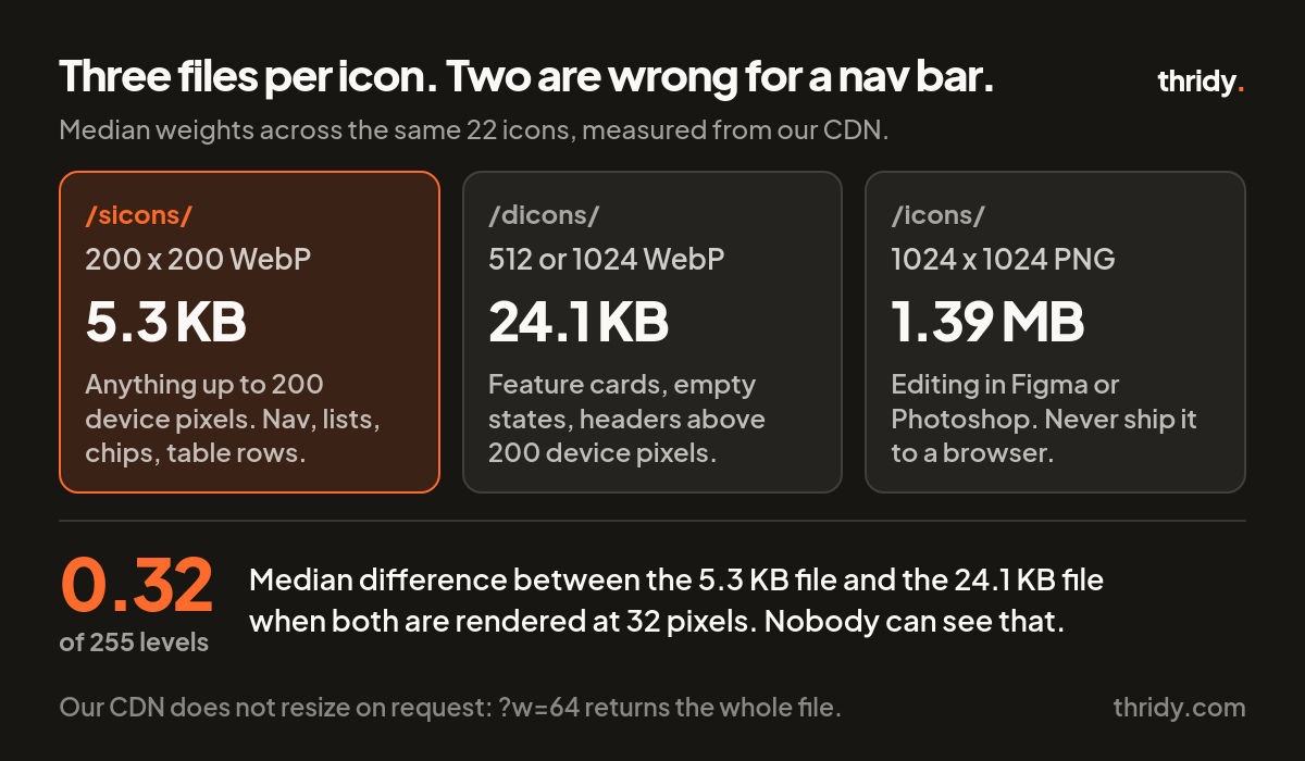
Every icon ships in three forms. The small file at cdn.thridy.com/sicons/ is 200 by 200 and ran 2.6 KB to 9.0 KB across our sample, median 5.3 KB. The display file at /dicons/ is 512 or 1024, median 24.1 KB. The download PNG at /icons/ is 1024 by 1024 and ran 1.21 MB to 1.56 MB, median 1.39 MB, which is 58 times the display WebP. The PNG is for editors that need it. It has no business in a browser.
So we tested whether the cheap file is actually worse. We rendered both the 200 pixel small file and the 512 pixel display file at the same target sizes and compared them pixel for pixel, composited on white. At a 32 pixel render the median difference between the two is 0.32 of one level out of 255. At 64 pixels it is 0.47. Even at a 200 pixel render, where the small file is at its native resolution and has nothing left in reserve, the median gap is 0.82 and the worst icon in the set reaches 1.48. Nobody can see a third of one percent.
The rule we use now
Multiply your CSS size by the device pixel ratio you are designing for. If the result is 200 or less, serve the small file. A 24 to 32 pixel navigation icon is 72 to 96 device pixels on a 3x phone, comfortably inside that, and costs 5.3 KB instead of 24.1 KB. For an eight icon sidebar that is 42 KB rather than 193 KB, for a difference you would need a diff tool to find. Above 200 device pixels, feature cards, empty states, marketing headers, use the display file, which is what it is for.
And if the design calls for 3D icons at 20 pixels in a dense toolbar, the answer is not a better file. It is a different icon.
Free 3D icons for this
Every icon on Thridy is free to download and use. A few that fit this piece:
- Red Rocket 3D icon
- Percentage 3D icon
- Pineapple Hand Grenade 3D icon
- 35mm Slide 3D icon
- Abandoned Factory 3D icon
- Aboriginal Didgeridoo 3D icon
Browse all 2,600+ free 3D icons or explore them by category.