You have a brand color. You have picked a 3D icon set. They do not match, and the obvious fix is a one-line CSS filter: hue-rotate the whole set until it turns your color. We wanted to know how well that actually works, so we measured it on our own icons instead of guessing.
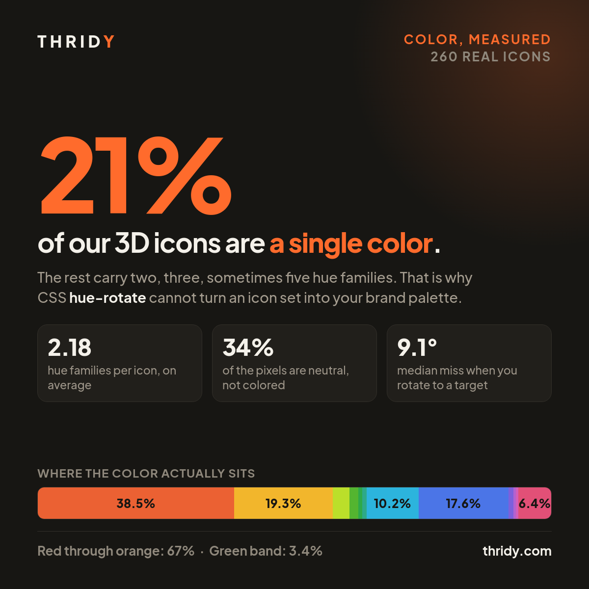
The short version is that it fails, and it fails for a reason that has nothing to do with CSS. Most 3D icons are not one color. Of the 260 icons we measured, only 56 carried a single hue. The rest carry two, three, sometimes five, and no single rotation can reconcile all of them with one brand color.
How we measured this
We pulled 1,050 icon records from our public API, sampling 21 pages spread evenly across a library that held 13,331 icons on the day we ran this. From that sample we downloaded 260 display files from our CDN and read them pixel by pixel. 232 of the files were 512 by 512, and 28 were 1024 by 1024.
For each icon we took every pixel more than 90% opaque and converted it to HSV. Pixels above 0.20 saturation and 0.12 value we called colored. Everything else we called near-neutral, which is the highlight and shadow that make the object look lit. We then binned the colored pixels into twelve 30-degree hue slices, and counted a slice as a "hue family" when it held at least 10% of that icon's colored pixels.
Most 3D icons are not one color
56 of 260, or 21.5%, came back with a single hue family. 117 had two. 67 had three. 15 had four, and 2 had five. The average is 2.18 hue families per icon.
This is not sloppiness on our part, it is what the style is. A flat SVG icon can be one path with one fill because it is a symbol, which is a real difference in kind and not just in file format. A 3D icon is a rendered object, and objects have parts. Our Bouquet icon carries four hue families because a bouquet has flowers, stems and wrapping. Cannabis Dispensary carries five. Even icons that read at a glance as "the orange one" usually hold a second color somewhere in the base, the screen or the cast shadow.
That one fact is what breaks the recolor plan, and we will come back to it.
A third of the icon is not colored at all
Across the 260, a mean of 34% of each icon's opaque area was near-neutral, with a median of 28%. That is the white specular highlight, the gray mid-shadow, and the soft falloff between them.
Some icons are almost nothing but that. Moon Jar measured 100% neutral. Mothball and Dance Silhouette measured 99.9%. Playing Cards measured 96.5%. 26 of the 260, one in ten, were at least 80% neutral. Hold on to those, because they turn out to be the answer for a lot of readers.
Where the color actually sits
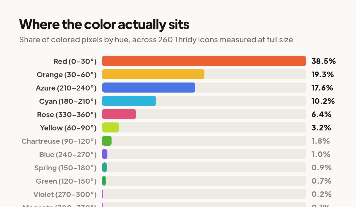
Pooling the colored pixels across all 260 icons, 38.5% of them land in red, 19.3% in orange, 17.6% in azure, 10.2% in cyan, 6.4% in rose and 3.2% in yellow. Everything else is close to a rounding error. The entire green band, 90 degrees through 180, accounts for 3.4% of the colored pixels. Violet and magenta together account for 0.3%.
Sorting by each icon's dominant hue instead of by pixel gives the same answer. Of the 257 icons with a measurable dominant hue, 50.2% sit within 20 degrees of orange and 41.6% within 20 degrees of red. A blue brand color at 217 degrees finds 23.0% of the sample. A green at 137 degrees finds 1.6%, which is four icons. Purple at 280 degrees finds three. Magenta at 320 degrees finds one.
If your brand is warm, or blue, the library already agrees with you and there is nothing to fix. If it is green or purple, it does not, and that mismatch is the thing people are really trying to solve when they reach for a filter.
What hue-rotate actually does
The CSS hue-rotate filter is not a hue rotation in any perceptual sense. The W3C Filter Effects Module Level 1 defines it as a fixed 3 by 3 matrix applied to the raw RGB channels: a luminance base of 0.213, 0.715, 0.072 in every row, plus a cosine term and a sine term scaled by the angle you pass. It is linear algebra on channel values, and it knows nothing about what your icon depicts.
One consequence of that is good news. Every row of that matrix sums to exactly 1.0 at every angle, which means a perfectly neutral pixel maps to itself. We checked it around the full circle and the drift never exceeded floating point noise. Pure white highlights and pure gray shadows come through completely untouched, so a rotated icon still reads as a lit 3D object rather than a flat sticker.
Where it breaks
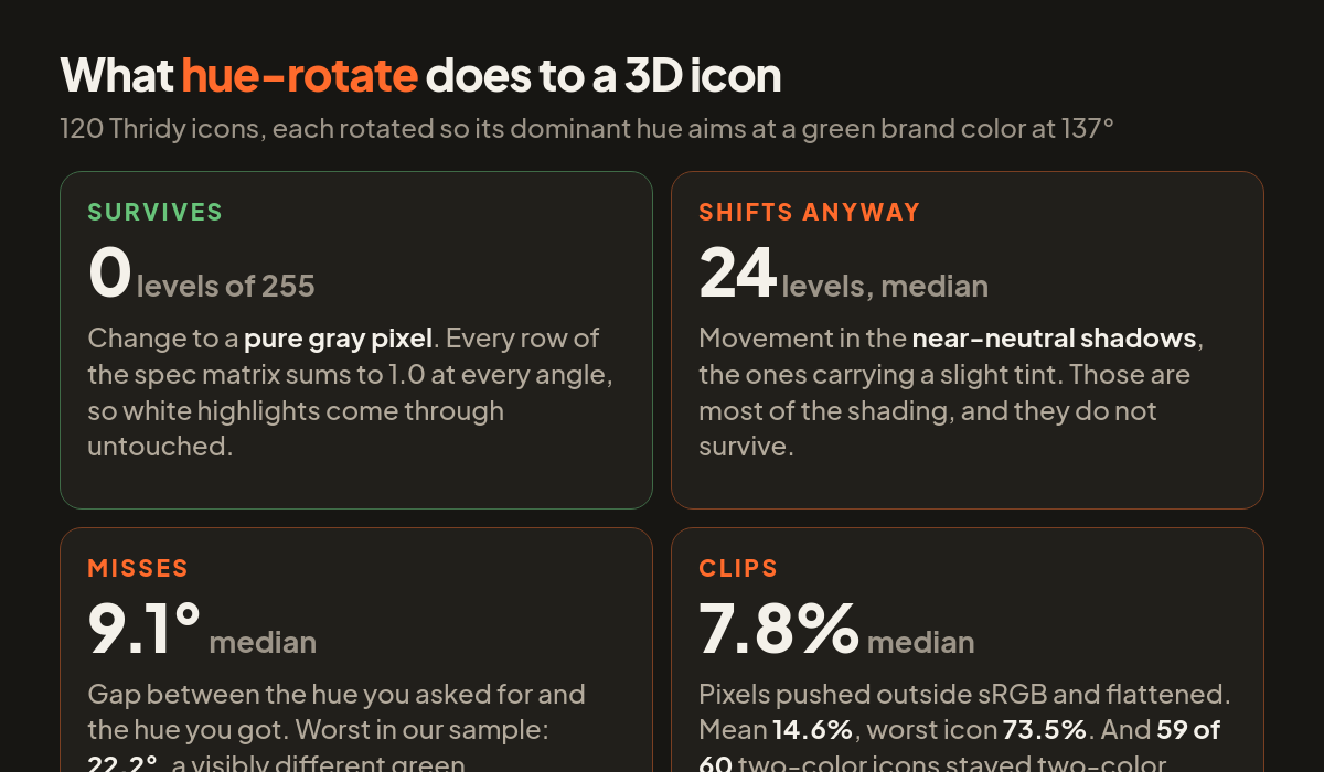
We then took 120 icons and rotated each one by whatever angle would aim its dominant hue at a green brand color at 137 degrees. Four things went wrong.
It missed. The median gap between the hue we asked for and the hue we got was 9.1 degrees. The worst was 22.2 degrees. You specify your brand green and you get a green standing next to it.
It clipped. A median of 7.8% of each icon's opaque pixels were pushed outside the sRGB range and flattened when clamped back in. The mean was 14.6%, because the tail is long: 24 of the 120 icons had more than a quarter of their pixels clip, and the worst of them, Cloudless Sulphur Butterfly, clipped 73.5%. Clipping is where the shading dies, because a gradient that runs past the top of the range comes back as a flat block of one color.
The shadows moved. Perfect neutrals survive, but pixels merely close to neutral do not. Pixels within 10% of neutral, which is where most of the modelling actually lives, moved by a median of 24 levels out of 255 and by as much as 39. That is well past the point of being visible.
It could not reduce the color count. Of the 60 multi-hue icons in that run, 59 still carried two or more hue families afterwards. A rotation moves every hue by the same angle, so the distance between an icon's two colors is preserved exactly. Turn the orange to green and the blue comes along, still the same distance away. There is no angle that makes a two-color icon a one-color icon.
What we do instead
Pick by hue rather than correcting afterwards. If your brand sits in the warm half of the wheel or in blue, hundreds of icons already match. Search by subject, then choose among the results by color. It costs nothing and it beats any filter.
If your brand is green or purple, reach for the near-neutral icons. One in ten of ours is at least 80% neutral, and a mostly white or gray rendered object sits beside any palette without arguing with it. Playing Cards and Moon Jar will not fight your green.
Put the brand color around the icon rather than on it. A tinted container, a colored card behind it, a brand-colored badge in the corner. The icon stays the object it was rendered as, and the surrounding surface carries the brand. The same logic applies when moving an icon set into dark mode: change what is behind the icon before you change the icon.
And if you do use hue-rotate, use small angles. Almost all the damage we measured comes from large rotations shoving channels out of gamut. Nudging an icon 15 or 20 degrees so it sits better with its neighbours is cheap and mostly harmless. Dragging it 130 degrees onto a brand color is neither.
What this measurement does not tell you
260 icons out of 13,331 is a 2% sample, and it is an evenly spread one rather than a random one: we took every 50-icon page at a fixed interval, then every fourth record within that. The 10% threshold for a hue family is our choice, and a stricter or looser one would move the 21.5% figure. The 0.20 saturation cutoff decides what counts as colored at all, and a different cutoff would shift the neutral share.
The rotation arithmetic we ran is the same arithmetic a browser runs, in the same non-linear sRGB space, so the clipping and miss figures should carry over to your page. Everything here came from public endpoints and public files, so you can rerun the whole thing against the icons you actually plan to ship.